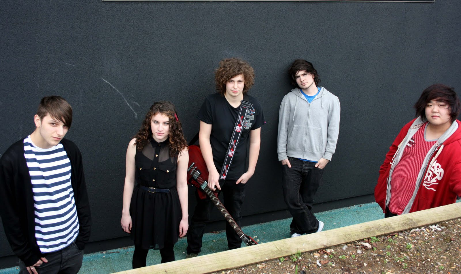
Blog Archive

Sunday 10 April 2011

Print screens of my Final Products


Evalution of Indie Cindy.

- Firstly I show how I got from my flat plan design to my final pieces. The things that’s changed were that they background was black therefore the 'Indie' was white. Also due to the fact I couldn't take the exact photograph I wanted for my contents page I had to change that around and add more images to the page.
-I used an issue of 'Rock Sound' magazine to help me design the layout for my front cover, I challenged the convention of using the colour pink as when I was researching, I found no other music magazines which used pink - I only found gossip magazines such as sugar- I think I works well because I have linked it with the black to show a girly edge to indie music.
- On my double page spread I added an advertisement which I saw in a double page spread from the issue of 'Rock Sound' this links to the 16-24(typical higher education age) age group I was aiming my magazine towards as they are more likely to react to an advertisement.
- The front cover also says that inside there will be a free mp3 download - this speaks out to the 16-24 generation.
-The images within my magazine represents the Indie scene as there are laid back images (such as the double page spread) and live images which after doing research I have found out those who listen to indie music are very likely to attend concerts. Also as the images are of musicians aged 16-24 it represents my target audiences' age group.
- After a lot of research I decided I would want Sonic Publishing to publish my magazine as they publish many rock magazines that are successful but not necessarily very well known such as Rock Sound, I thought this would go well as Indie musicians are also successful but not necessarily very well known.
- Looking back at the prelim task I have learnt a lot more about the layout of typical front covers and colour schemes to attract your chosen audience.

Saturday 9 April 2011

Why the name Indie Cindy?

I first heard this from a song called 'That Boy That Girl' by 'Hadouken!’ I think this fits in well with the fact that I am targeting my magazine to girls who listen to indie music- as magazines like NME and Kerrang are mainly aimed at males. Also, most magazines aimed at girls are about the celebrity’s lifestyles and not about the music. I saw this as a gap in the market so that is how Indie Cindy was created!

Monday 14 March 2011

How i edit my magazine front cover using photoshop

To start my magazine I needed to edit my main photo of the band I am featuring. I first edited the levels and the contrast of the photo to make it look the best it can and then I began to edit out the background so that it’ll be easier for me to place it on my front cover. To do this I used the rubber tool.


When I made the background black by using the fill tool, there was a bit of a contrast between the background and the image so I clicked on ‘Layer’ then ‘Effects’ and then selected ‘Inner Shadow’ which made the photo blend in a lot more with the background.


I then needed the font for my masthead – I decided that I wanted ‘Indie’ and ‘Cindy’ in two different fonts to show the contrast but also link them together as my target audience is girls who like indie music. For ‘Indie’ I chose a font from the internet which is quite rough and represents the indie music genre. However I wanted a black background and white writing so..


To change around the background and font colour I clicked on ‘Image’ then ‘Adjust’ and selected the ‘Invert’ option.


I then began to try out different colour schemes. After researching, I realised that most music magazines use the colours black, white and another colour. I decided to follow this convention and use the colours black, white and pink to represent my target audience.


I thought the red clothing worn by one of the members clashed a bit with the pink so I selected “image” and “replace colour” and clicked on the item of clothing and made it a bit darker to blend in more.


 To make the “Cindy” stand out more but still look like it is part of the “indie” I made the font white but added a pink “drop shadow” by selecting “layer style”.


To follow the conventions of the magazines I analysed I added a banner at the bottom with artists who would be featured in my magazine and I added photographs at the top to advertise was the posters inside would look like.


I then added more conventions of typical music magazines such as pull quotes, barcodes, pricing, issue numbers etc.


Wednesday 9 March 2011

Interview with Siren

Band members:
Sam Yung – 18 years old – Drummer/ keys/ songwriter
Alex Fowkes-Smith – 18 years old – Bassist
Scarlet Billham – 18 years old – Singer/ songwriter
Alfie Jefferies- 17 years old – Guitar/ electronics
Sam Ayling – 18 years old – Lead guitar

So how long have you known each other and how did you meet?
Sam Yung: “We’ve known each other going on two years now – seems like ages ago! We met at college. At the Brit school you can join at GCSE which is what I did or you can join for A-level which is what the other band members did. This is how we met”
And how long has your band been formed/ who came up with the idea?
Sam Yung: “It was me and Scarlet who first decided we could form a band – purely from mutual musical taste. We liked the same genres. We used to just jam cover songs, and then we realised we could write our own material.
How was the band name ‘Siren’ decided? And was this your first band name or did you have another one before?
Scarlet Billham: “Siren was our original name for the band. Basically, Sam [Yung] and I are both English A-Level students and we had been racking our brains for weeks trying to think of a name for our band and we decided our name should be based on something to do with Greek myths. The siren women lured the sailors with her unique and beautiful voice – and then she eventually killed them – but ha I won’t do that! The name suited us as I am the only girl in the band and a lot of signs pointed to us naming ourselves ‘Siren’.”
Sam Yung:  “modest! Haha!”
So I’m assuming Scarlet and Sam Yung are the main song writers – how do you get your inspiration and what do you find that the main topics of your songs are?
Sam Yung: “It’s weird because me being the drummer, I write a lot of our songs. It’s mainly me and Scarlet who do the bulk of the writing but Sam Ayling will also do his bit of writing too. Usually we collectively decide what we like and what we don’t. Inspiration comes from all sorts of places and at any time. Song writing for me is just something that happens – you just necessarily plan it or decide ‘I’m inspired now so I’m going to write a song’ – it just happens. Whether the song is good or not really depends”
Scarlet Billham: “yeah I agree completely. I find inspiration from lyrics, when I’m listening to music or just something that seems a relevant topic to discuss. Usually though, the music directs to what the song should say”
So what genre of music would you consider your band to be and who are your major influences?
Sam Yung: “I’d say alternative rock. My personal inspirations come from all over the place like ‘Now Now’, ‘VersaEmerge’, ‘Paper Route’, ‘Utada Hikaru’, ‘Copeland’, ‘Lydia’ – those kinds of bands. Also, a ’, ‘Copeland’, ‘Lydia’ – those kinds of bands. Also, a ’, ‘Copeland’, ‘Lydia’ – those kinds of bands. Also, a lot of orchestral stuff from ‘Hans Zimmer’, ‘Nobuo Uematsu’. I’d be surprised if anyone heard of most of those guys!”
Scarlet: “I would say we are alternative rock with an electronic/orchestral side. Depending on the song. Erm, yeah, we have a lot of influences. ‘Paramore’ started us off because we because we all realized we liked them so they did influence us to begin with and to a certain extent still do now. But, more alternative bands like ‘Now Now’ and ‘VersaEmerge’ who incorporate synths and string ensembles in their music inspire us to be more creative with instrumentation and sounds. For me, bands like ‘Radiohead’ and ‘Muse’ inspire my lyrics and the way in which they structure songs.
I can definitely see how you get inspiration for those bands- I love VersaEmerge! Do you think the genre/sound of your music has evolved since you first began playing together as a band?
Sam Yung: “Sweet! Yeah recently saw them live! Well at first when we first started out, we didn’t really experiment with much instrumentation. It was very much just guitar, bass, drums and vocals. Now out taste has expanded, we use keyboards, piano’s, strings, weird synth sounds and all. Out music is still the same at its core but it’s definitely developed since we first started playing. Some have said it’s become more mature over time and the song writing has improved because of it.”
Scarlet Billham: “i definatley think we have evolved since we started playing together. Now, we have no boundaries and are completely open to new ideas and suggestions. Were not scared of one another and have fun experimenting with new sounds.”
Alfie Jefferies: “It’s pretty difficult for me to give insight on Sirens influences and how we’ve changed our sound because I’ve only recently joined. I suppose the sound is going to change slightly in a band if a new member steps into the scene. When sirens previous guitarist left, they were gigging as a four piece, and it was only upon my arrival to the Brit school that I’d heard of their music and I really like it! I’d never want to change the sound of Siren because it’s what we all love playing and that is our sound – but id definitely love to incorporate more electronics combining software and hardware to do so. Even if that means stepping away from the guitar for some new songs. The reason that I’m so keen to incorporate electronics into sirens set is because we can do it, and it sounds amazing when it is done right, it’s all just about experimenting ad manipulating different things. Personally, I take a huge influence from bands like ‘Enter Shikari’, ‘Crystal Castles’, ‘Radiohead’, muse and probably a lot more, it’s taken from a vast variety.”
How comes your previous guitarist left?
Sam Yung: “Our previous guitarist left through no hard feelings between any of us, it was purely because he was so uncertain with that he wanted to do in the future, he didn’t want to commit to something that may stop him from doing other things, which is completely understandable. O it was a completely understandable. So it was a completely mutual thing, and we are still very good friends with him now!
So when you guys were younger, what was your upbringing like with music?
Sam Ayling: “I used to listen to a lot of older rock and then more stuff like ‘Nickelback’ and then – i moved to listening to more alternative stuff.”
Sam Yung: “When I was younger I listened to completely different bands that I do now. My favourite band used to be ‘The Corrs’ – the Irish band haha. I used to really like their melodies and I suppose some of that has transferred over to our writing now. I used to like anything with a strong sense of melody. My parents listen to bands like ‘Pink Floyd’, ‘Fleetwood Mac’, ‘The Eagles’ and ‘Tears for Fears’, so I was kind of brought up with all that kind of music – they’re all melodic bands.
Thank you for talking to us we look forward to hearing your upcoming album.

Sunday 20 February 2011

Contents Page Design Idea

This is a rough drawing of what conventions and design ideas i may use in my final product

For my contents page, I have continued the theme of the front page my using the colour scheme of black and pink/purple. I have used the same font that I used for ‘indie’ in the masthead to write ‘Contents’ across the top of the page and to write ‘Main Features’ above the contents of the magazine.  I used the font and colour of ‘Cindy’ in the masthead to write the date and the page numbers.
I have decided that I want the contents page to be one big photo like the contents page I analysed from ‘Rock Sound’.
I want the photograph to be of a live musician to link in with a feature in the magazine ‘Top 40 UK gigs voted by you’.  Because I haven’t taken the picture yet, I do not know if I can have black writing for the descriptions like I have designed. If black does not show up, I will use white as it is a neutral colour and won’t change the colour scheme of the page.

Front Cover Design Idea

This is a rough drawing of what conventions and design ideas i may use in my final product.


As my magazine is an indie magazine aimed at girls, I decided to name it “Indie Cindy”. I got this idea from a lyric in a song by a band called ‘Hadouken’. 
The masthead in my design has ‘Indie’ written in white on a bold black background and then to contrast that, ‘Cindy’ written in calligraphy in a pink/purple colour.
I decided that I wanted the band I would feature to be looking straight at the reader to make it seem a lot more personal. I also like the idea of having one member of the band in front of the masthead and the rest of the band behind – I got this idea when I was analysing ‘Rock Sound’, it stood out to me as most magazines do not do this.
I decided I would follow the typical convention of a magazine by having the band’s name on layered on top of the photograph to one side, then underneath a pull quote of what they say within the double page spread interview.
The front page to ‘Indie Cindy’ also has a band at the top of the magazine and at the bottom. I feel that using these bands gives easy space to promote what is inside of the magazine without writing too much over the main photograph – along with this I also use buttons to promote what is inside.
My main colour scheme is Black and pink/purple however I have included some blue and red in my design.  I am not sure if I will follow through with using these colours in my final piece.

Wednesday 9 February 2011

Contents Page Analysis


I looked at the contents page of Rock Sound and have analysed the presentational features and the language used. I can then conclude as to what conventions I may use for my contents page.


The Image of Rock Sound’s contents page takes up about ¾ of the page. The image links with the main article within the magazine and the page number and description for this article is the bigger than the rest and is the only one that isn’t placed on the column and is placed on the actual image – this shows what the main feature is within this issue. Usually it is an artist who is on the front page, but this time it isn’t which could show that there are two main features in this issue.
The colour scheme of the page is mainly black and white as the natural background of the photograph is very dark. The dark colour could represent the genre of the music that this magazine is aimed towards. They have cleverly linked the green from the front page to the contents page by having the page numbers and the border around the words “main features” green. Also, Oli Sykes (the man in the photograph) is wearing a top that is white and green which fits in with the colour scheme – this is important because of how much focus the image is on this page.
The top of the contents page says “Rock Sound” and has the issue number and date on it – Rock Sound is written in the same font as it is written the masthead which is important.   

To write the pagenumbers and description title they use a larger font than the use for the description which is a convention which most magazines tend to use for their contents pages. Reasons for this are because it is a lot easier for the reader to understand what goes where therefore they can find the pages they are looking for easily.

There are yellow and red buttons on three of the article titles - this shows the main features of the magazine.

Friday 4 February 2011

Front Cover Analysis

The two magazines i have chosen to analyse are


I looked at the front cover of each of these magazines and have analysed the presentational features and the language used. I can then conclude as to what conventions I may use on my front cover.

For RockSound I am analysing this front cover which features the band Paramore.


The masthead of rocksound is on a continuing white background in capital letters and bold green font, this really stands out and improves it's visibility in stores.
The main photograph is the band Paramore where the lead singer Hayley Williams is the only band member who is placed in front of the masthead which shows she is the main focus. Her angle of gaze is straight at the audience which immediately makes it seem a lot more personal.
The main cover line of this particular issue is "The Future Revealed.. PARAMORE - 10-page special" which is also a teaser as they use words like 'Revealed' and 'Special'. On the opposing side they have written 'Epic Reading & Leads Preview' which catches peoples eye along with the 'All Time Low & For Year Strong GIANT POSTERS!' which also attracts peoples attention, and importantly for this magazine, attracts the attention for both genders.
Like a lot of magazines, Rock Sound have a 'Plus' section which in this case is placed at the bottom stating bands names which would immediately increase their audiences interest if they see their favourite bands name written there - even if there is only a small paragraph about them within the whole magazine.
At the top of their magazine there is a button with "+Win! your band opening for BMTH!" which is placed on the right of the cover which is where Rock Sound usually place a button - this is good for their usual readers as they know where to find what they can win from each issue without having to search over the whole cover.

For NME I am analysing this front cover which features the band Glasvegas.


The masthead of NME is always placed on the top left hand corner of the cover which stands out to readers. Usually their masthead is black white and read however due to the 'NME award nominations being revealed' they have changed it slightly and have it in just a bold black colour. Even though they have done this they have incorporated the red and white throughout the rest of the cover including the background and the cover lines to keep their image.
The main photograph is of the singer of the band Glasvegas. Glasvegas is written in a font which is only just smaller than the font of 'NME' so there is a lot of focus to it. It is also rhe only word/photo which is placed behind the photograph which explains that there is a link between the photograph and the band name for those who do not know him.
The main cover line is "Rock 'n' Roll Returns" which makes the magazine appeal to an older audience than my target age group of 16-21.
This cover includes just one main short pull quote "We're bulletproof" and another less obvious one "More civil unrest's coming" which is good because it is not too overwhelming but does give the readers an insight as to what is inside.
NME use a lot of teasers such as "FREE" "Revealed" "New" etc. This keeps their current buyers interested and interests others as well.

What I want to include in my double page spread

·         Full page photo
·         Vintage look – Sepia?
·         Casual language
·          Pull Quotes
·         Changing the interviewee’s name to not sound repetitive eg. ‘Oli Sykes’, ‘Sykes’ and ‘Bring me the Horizon front man’.

Wednesday 2 February 2011

Double Page Spread Analysis

The two magazines i have chosen to analyse are


I took a double page spread from each of these magazines and have analysed the presentational features and the language used. I can then conclude as to what conventions I may use on my own double page spread.


For NME I have chosen to analyse this interview on Barry Nicholson from ‘The Streets’.


The photograph in double page spread flows over ¾ of the two pages and the article is set on one side. The photograph is also in sepia which represents his classic ‘vintage’ rock style and musical taste. The Sepia tone also links in with the sepia tone of their album cover. Within the photo, Barry Nicholson is set on a road waiting for a car which cleverly matches the title of the article “End Of The Road” which also links to the band name “The Streets”.
The way there is a lighter within the page also represents his typical “rock & roll lifestyle" giving people who don’t necessarily know his bands music an insight on what style it is.
Within the introduction to the interview, there are informal words such as “geezer” which shows the casualness of the following article. The article begins with a drop cap to make it clear on where it actually starts – simple, but very effective.
In the middle of the actual interview, there is a blue section of writing which gives us an insight on who Barry Nicholson is and some facts about his band – this is a way to get people who arn't necessarily fans of The Streets to become interested in them and feel like they know them and him a little more.

The next double page spread I analysed was from the magazine ‘Rock Sound’ and is an interview with ‘Oli Sykes’ the lead singer of the band ‘Bring me the Horizon’.


I really like the layout of this double page spread as it flows very well. The photograph is spread across the two pages however the white section for the writing makes it easy to read. They have placed Oli Sykes (the interviewee) in the middle of the photograph to put the focus on him.
The introduction to the article is very chatty and gives the reader the impression that they are talking to the ‘Bring me the Horizon’ band member themselves. To not sound very repetitive within the article, they alternate from naming him ‘Oli Sykes’, ‘Sykes’ and ‘Bring me the Horizon front man’. I will this technique in my own magazine as I find it very effective.
On the opposing side of the interview there is a pull quote which not only intrigues people to read the interview but in this case is also promoting their album.

Reader Profile

Based on the results of my survey I have conducted a reader profile which will help me during the making process of my magazine. So here I explain a typical girl who would buy my magazine:


Alexa is an 18 year old girl who is in her last year of sixth form; she is currently studying Music and Textiles. She has always had a passion for both music and fashion and this is a big part of her life and personality.
Alexa is going to university next year to study Events Management in Music as she loves to attend gigs and festivals so would love to make a career out of it. She plays the guitar and loves learning songs by her favourite band ‘The Wombats’ who she has seen live 4 times.
She buys a lot of music magazines as she loves reading about the glamorous life of all her favourite bands; however she feels that the magazines she buys such as NME and Q are more so targeting a male audience and would rather the same type of magazine but with a slight girly edge to it. Nonetheless, she buys both these magazines monthly.
As i said, her all time favourite band is ‘The Wombats’ but more of her favourites are The kooks, Paramore, Panic! At the Disco, The Killers, All Time Low and The Kaiser Chiefs.

Friday 28 January 2011

These are the results to a survey i asked various people from my target audience to complete

Below is a presentation showing the results on a survey i conducted.
This survey made me realise a few things about my target audiences' preferences within a magazine such as:
- They have a wide range of musical interests, therefore I could include a few similar genres to Indie.
- NME seems to be a very popular magazine to the 16-21 age group I surveyed. Because of this, i will do further research on NME so i can see what makes it so successful.
- Most of the people were also interested in Indie fashion as well as the music. This tells me that the mise en scene within my magazine is very important.